Tutorial: Data Mapping with Carto
- First, make an account with Carto. (Or log in here if you've done it in advance).
- Next, go get a dataset to use. We'll all start by using this dataset of Grocers and Fruit/Vegetable vendors in 1907. Download this onto your desktop. Later you can try out a set of your own. Please note that this dataset is incomplete and definitely sloppy. I did not correct errors from the text recognition, and deleted some entries that were not copying and/or geocoding smoothly.
- Once you are logged in, go to "Your Datasets" on the top nav bar, and then click "New Dataset," a button on the top right. (You might have to click on "Maps" on the top left to bring down a dropdown menu.)
- You can drag and drop the grocery.csv dataset (or browse to it) to upload it. (Note you can also point it directly to a google drive/dropbox/box file). I had you download this one so we can make some changes to it later. Click "Connect Dataset" to finish the upload. It may take a minute to process.
- Next Carto will take you to a data view of what you just uploaded. Check each of the header entries to make sure it matches the type of data in that column.
-
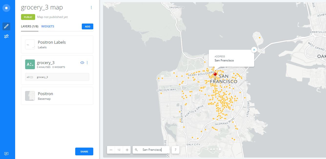
Next click on "Create Map" on the bottom right. It will take a minute to process, but if it's your first time using Carto, a screen pops up offering to take you on a tour or to edit your map. Feel free to click "take a tour" and then click "edit your map"
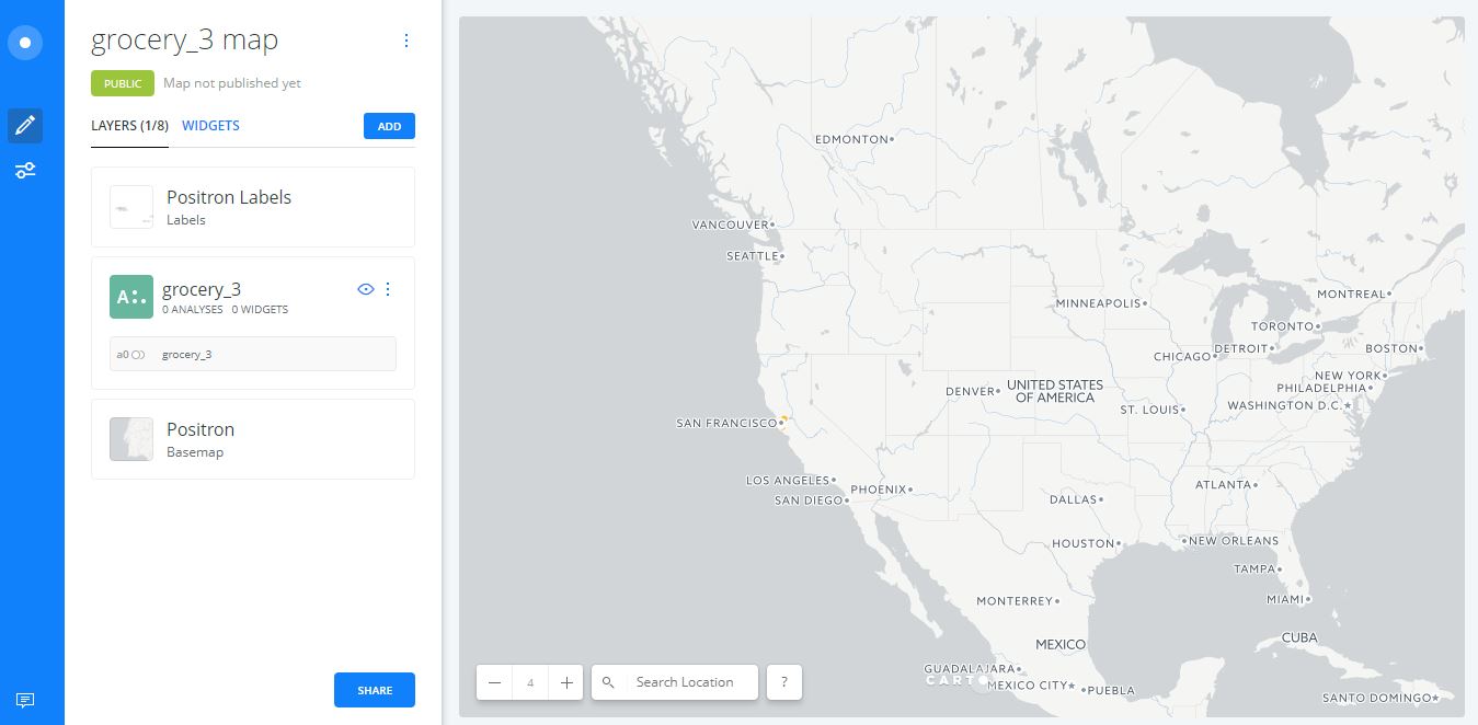
- Carto now shows us a map that's very zoomed out (see above), but we can see that there are some points plotted in the San Francisco area. Click on the search bar in the bottom left of the map, type "San Francisco" and click enter. The map should now zoom into San Francisco so you can better see what's plotted. (You can also use the zoom + and - to zoom in and out.)
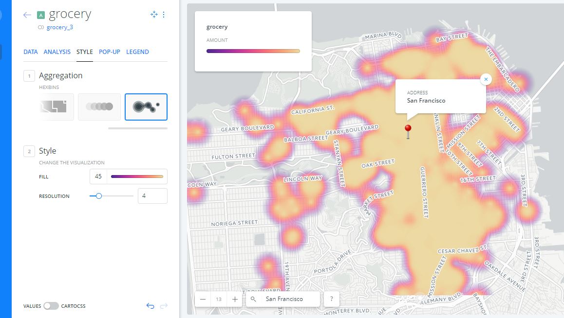
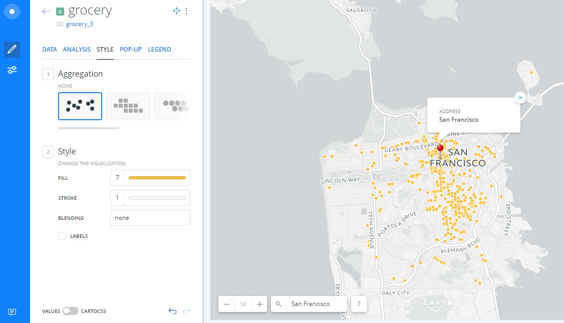
- Now let's try to style this map. Click on the button that says "grocery" on the left panel to see our styling options. Carto brings up a screen with styling options (it should start under the "style" tab). Under 1. Aggregation, try clicking the different buttons and see what they do. (Try zooming in and out to see how this changes the effect.) Which of these suggested maps is useful / interesting? Why or why not?
-
The three that will probably be most interesting to us in this class are the default style "None," and the last two, "Animated" and "Pixel." Each of these layer styles has an assortment of options for customizing the style also.
- "None": Just a basic map - it plots each of the points in our dataset in one color. Try out some of the fields -- what do the different functions do to the map
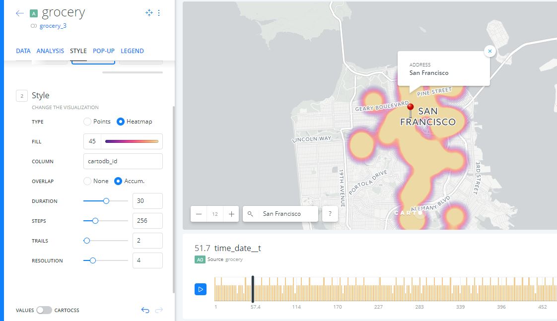
- "Animated": Animates data as a progression of time-series data. You can display temporal data and animate a progression of points, based on a data column containing a time stamp or date. This also works (in our case here) with an index value. Is this field useful in visualizing this dataset? Try toggling "accum" under "Overlap." Try also switching from points to heat map - which offers a clearer visualization?
- "Pixel": This creates heatmaps. Areas of greater color intensity indicate a larger density of data. How is this different than the Animated layer with heat maps toggled?
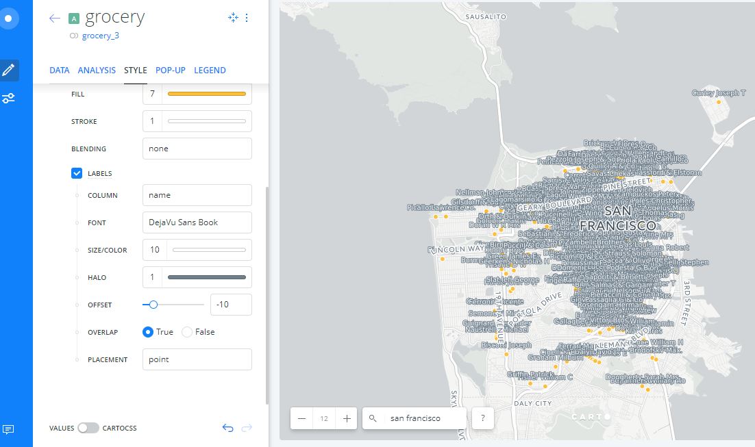
- Next let's add some captions. First change your map back to "none" (some map types don't allow captions). Click on labels in the settings for the "none" aggregation. For column, select "name" to show the business name. What does this labels features do? Does this work for our map? Why or why not? When would this feature work well?
- Let's try this a different way now. Toggle labels off. Next to the style tab (near top of the left tool bar), click "Pop-Up." Choose a style "light" or "dark." Now you should see an assortment of settings below. Toggle on "name," "address," and "category." You can also drag and drop these to change the order they will appear. Now go click on a point, and you can see how this pop up label appears. You can also change the window size, and you can also set pop-ups for if you hover over a point (near the top of the tool bar). Is this style of labeling more or less effective? Why or why not?
- Next, we'll change the basemap. In the upper left corner of the toolbar, click the back button, and select the basemap button. Try out a few basemaps. Which base maps do you prefer, and why?
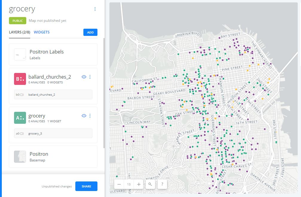
- Next we'll create a widget in our map to relect the different categories of items in our dataset. Click "widgets" near the top left (next to layers), and click the "add widget" button. Check the box next to "category" and click "continue." Keep all of the settings (category will allow us to differentiate by category; there are also timeline widgets you can embed here). The only thing we want to change right now is to click the water drop button in the top right "auto-style," which will now differentiate the points by the "category" listed in our dataset. Now we can distinguish between Retail Grocers and Fruit/Vegetable Stores. Click on "Grocery-Retail" in the top right, and we can see also how this creates an interactive map.
- Next let's Add a layer. Click the "Add" button near the top of the main screen of the left bar.
- Let's try overlaying a layer of SF churches onto our map. Download this dataset that Ashtin made, and add it as a layer by clicking "Connect Dataset," drag and drop it on to the screen, and then "Add Layer."
- This creates a map with a new color of points on it, and now on the left toolbar you see the new layer labeled with the name of the datset Why do we not see churches listed under our widget on the right? Try clicking on one of the new church points? What happens, and why?. Note that you can make many of the changes you did to the first layer on this layer too.
- Under OPTIONS, you can toggle a series of options (click on the slider bar icon under the pencil on the blue toolbar on the extreme left) Here you can remove the search box, etc. Test out a few of these options.
- To PUBLISH this map, click the green "Public" button near the top of the toolbar on the left. Then click the "Publish" button. After you make changes to the map, you will need to republish to be able to update it online (follow these steps again, and click "Update"). You can then either download the link to share the map, or download the code to embed it in a blog or other web format. You can also get to these features by clicking the "Share" button at the bottom of this left toolbar.
In our next class, we'll look at downloading and using large free datasets from the web and making a custom basemap. In the remaining time today, upload your dataset and play with the different map tools and settings. What wizards work well with your dataset, and why?

Animated Example:
Pixel Example: